


 [See full document here.](https://biigpongsatorn.github.io/#/vue-element-loading)
# ⚙️ Props
| Props | Type | Default | Description |
| ----------- |:--------------| ---------|--------------|
| active | Boolean | - | Status for show/hide loading |
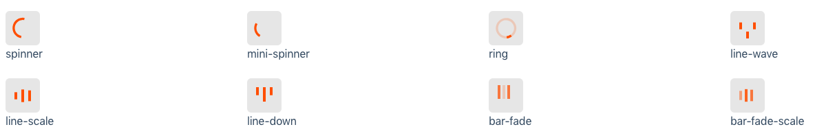
| spinner | String | spinner | Spinner icon name: `spinner`, `mini-spinner`, `ring`, `line-wave`, `line-scale`, `line-down`, `bar-fade`, `bar-fade-scale` |
| color | String | #000 | Color of spinner icon |
| background-color | String | rgba(255, 255, 255, .9) | Background color of spinner icon (for overlay) |
| size | String | "40" | The size to display the spinner in pixels (**NOTE:** this will not affect custom spinner images) |
| duration | String | "0.6" | The duration of one 'loop' of the spinner animation, in seconds (**NOTE:** this will not affect custom spinner images) |
| delay | Number \| String | 0 | The minimum appearing duration of loading in seconds |
| is-full-screen | Boolean | false | Loader will overlay the full page |
| text | String | - | Text will appear below loader |
| text-style | Object | {} | Change style of the text below loader |
# 🤝 Contributing
1. Fork this repository.
2. Create new branch with feature name.
3. Run `npm install` and `npm run dev`.
4. Create your feature.
5. Commit and set commit message with feature name.
6. Push your code to your fork repository.
7. Create pull request. 🙂
# ⭐️ Support
If you like this project, You can support me with starring ⭐ this repository.
# 📄 License
[MIT](LICENSE)
Developed with ❤️ and ☕️
[See full document here.](https://biigpongsatorn.github.io/#/vue-element-loading)
# ⚙️ Props
| Props | Type | Default | Description |
| ----------- |:--------------| ---------|--------------|
| active | Boolean | - | Status for show/hide loading |
| spinner | String | spinner | Spinner icon name: `spinner`, `mini-spinner`, `ring`, `line-wave`, `line-scale`, `line-down`, `bar-fade`, `bar-fade-scale` |
| color | String | #000 | Color of spinner icon |
| background-color | String | rgba(255, 255, 255, .9) | Background color of spinner icon (for overlay) |
| size | String | "40" | The size to display the spinner in pixels (**NOTE:** this will not affect custom spinner images) |
| duration | String | "0.6" | The duration of one 'loop' of the spinner animation, in seconds (**NOTE:** this will not affect custom spinner images) |
| delay | Number \| String | 0 | The minimum appearing duration of loading in seconds |
| is-full-screen | Boolean | false | Loader will overlay the full page |
| text | String | - | Text will appear below loader |
| text-style | Object | {} | Change style of the text below loader |
# 🤝 Contributing
1. Fork this repository.
2. Create new branch with feature name.
3. Run `npm install` and `npm run dev`.
4. Create your feature.
5. Commit and set commit message with feature name.
6. Push your code to your fork repository.
7. Create pull request. 🙂
# ⭐️ Support
If you like this project, You can support me with starring ⭐ this repository.
# 📄 License
[MIT](LICENSE)
Developed with ❤️ and ☕️